Energy Mapping
Kilowatt, Gigawatt, Terawatt, What? ( kW, GW, TW, W?) forms part of Max Fordham’s ongoing research into the UK’s use of energy within the built environment.
The team was invited to participate in an exhibition on the theme of data mapping.
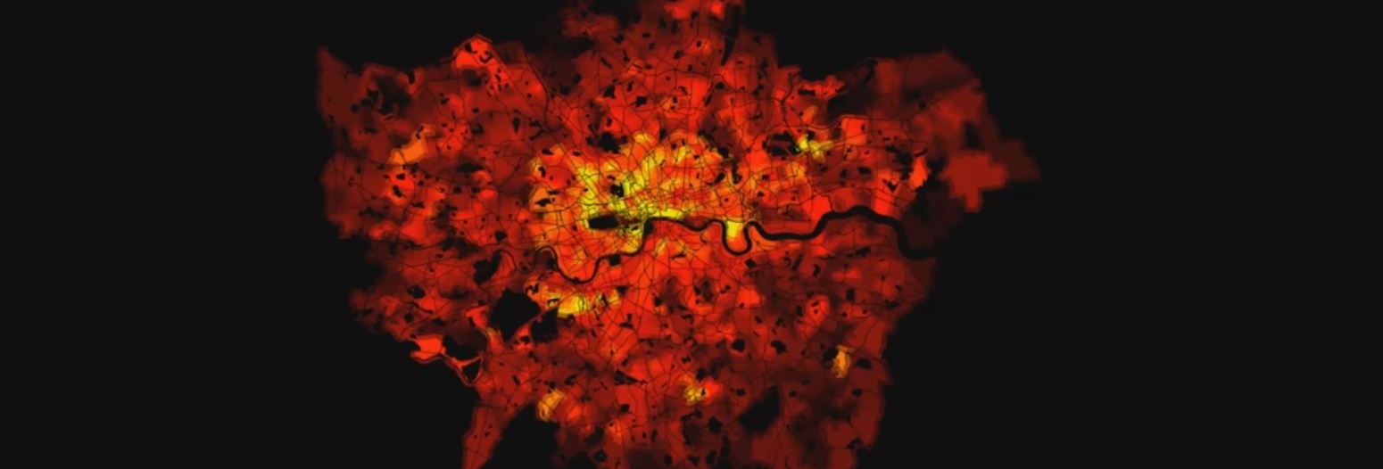
The piece itself is an animated digital visualisation of energy use in London over a typical day. The group used geographical census data along with their own numerical simulations to produce a model of where and when we use heat and electricity throughout the capital. The resulting animation illustrates the distribution of intensity in human activity as it shifts from residence to work place and back again.
Some key times show the flow of energy from the suburbs to the business districts and back again throughout the course of the day.
- 06:00 - 09:00 (5s) Suburban areas show a rise in energy use as people wake up.
- 09:00 - 17:00 (5s) Centralised business district show a rise in energy use, energy use in suburban areas drops as homes are vacated.
- 17:00 - 22:00 (5s) Suburban areas show a rise in energy use as people return home from work and use appliances in their homes in the evening.
Kilowatt, Gigawatt, Terawatt, What? is intended to fascinate, inform and bewilder.


.jpg)